Some people are die-hard sports fans. Actually that's an understatement; expectations were shattered when 219 million people tuned in for the 2012 London Olympics, an increase from the 215 million views for the 2008 Beijing Olympics. Social media was frequently updating which country won gold and which had the most handsome diver. Then there's people like me who didn't bother to check scores or who weren't interested in the whole spectacle. Though I didn't glue my eyes to my T.V. for 17 straight days, I'll confidently answer to people what I remembered; the logo and the graphics.
 |
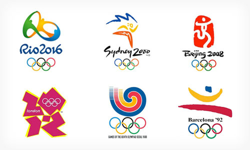
| From left to right: Rio 2016, Sydney 2000, Beijing 2008, London 2012, Seoul 1988, and Barcelona 1992 |
The Olympics didn't always start off with emphasis on branding and graphic design. Steps started off small, but overtime graphic designers rapidly worked together to achieve unity and diversity. The textbook nicely summed up how each game from each country worked towards building a graphic system that would later help create an identity program. As time passed, graphic designers learned from the mistakes and successes of others and they were all fighting for good design that would effectively communicate to the world of their home countries' traditions, values, and history.
But how did graphic design affect the 2012 London Games? And how did the 2012 London Games affect graphic design?
 |
| Pictograms |
 |
| Logo |
Well for starters, responses from critics and the public were mixed. Some newspapers in London praised Wolff Olins (company in charge of the branding) for their new and fresh take on the branding whereas many others attacked them for making something so sloppy and messy. Designers screamed in horror as soon as they saw this "
logo disaster" and people were demanding the company for answers.
Far different from what we saw from Beijing, a simplistic logo that mimics brush strokes and worked together beautifully in harmony, the London logo has nothing that was related to London's iconic landmarks. The pictograms were understandable nevertheless, but how did these bright colors relate? Chairman and managing director from Wolff Olins clarified and knew what was coming at them. They broke the rules and people didn't like that. They drifted away from getting inspiration from London's most well-known places and tradition and embraced the
new London. Social media was popular and it was obvious the branding company felt compelled to include that in the 2012 Olympics. So they embraced the creative, modern energy that was undergoing in London, the enthusiasm from the youth who were caught up with Youtube and Facebook, and invited graphic design students from
Chapman University to help them with branding. The colors were lively and the logo consisted of sharp, unpredictable lines that reflected the new London society. Additionally, both teams decided to do the unexpected and for the first time in history, the Paralympic Games would use the same brand, only with different variations of colors.
 |
| Paralympic Games Logo |
Wolff Olins was surprised to hear such heated remarks about 2012 brand and logo, but it didn't backfire them either as this was the most watched Olympics
and television event of 2012. So maybe this wasn't a complete disaster after all. Like past Olympic branding, the 2012 branding wanted set itself a part from others and wanted to be remembered. But unlike what the world has seen in the past, Wolff Olins encouraged their teams to break the rules and be different. And breaking the rules, as we've seen in our textbook over and over, will always pay off.
sources:
http://tvbythenumbers.zap2it.com/2012/08/13/london-olympics-on-nbc-is-most-watched-television-event-in-u-s-history/144780/
http://www.designboom.com/design/london-olympics-2012-the-look-of-the-games/
http://www.fastcodesign.com/1670429/the-surprisingly-smart-strategy-behind-london-s-infamous-olympic-branding#6
youthdesigner.com


0 comments:
Post a Comment